
Groove Life

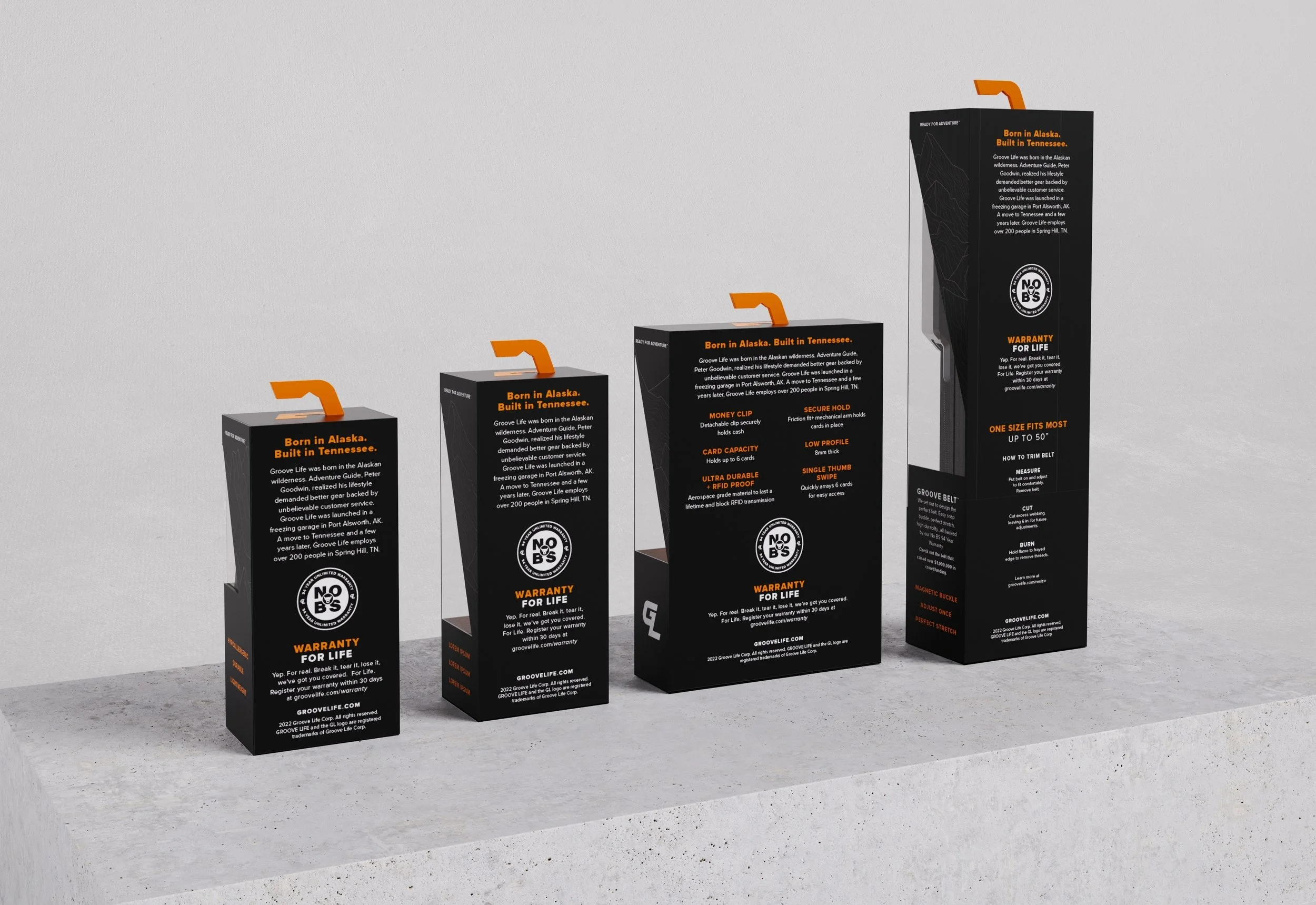
I was able to work with Groove Life on a full packaging rebrand with the purpose of unifying their packaging and bringing an elevated experience to their consumers. The goal was to make the packaging feel adjacent to the price point and quality of
the product.
This process also included designing around customer and business feedback, creating packaging that allowed the consumer to touch and feel the product without completely opening it.
-
![]()
Back of Pack
-
![]()
Front Belt Angle
-
![]()
Front Ring Angle


Design Process
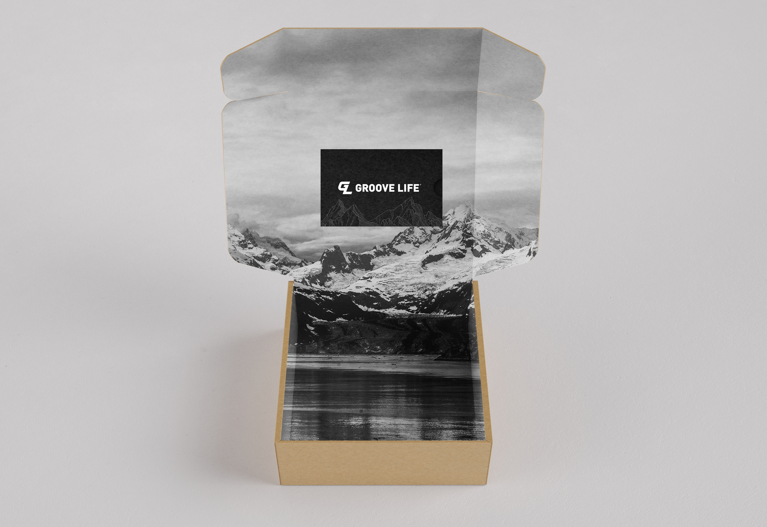
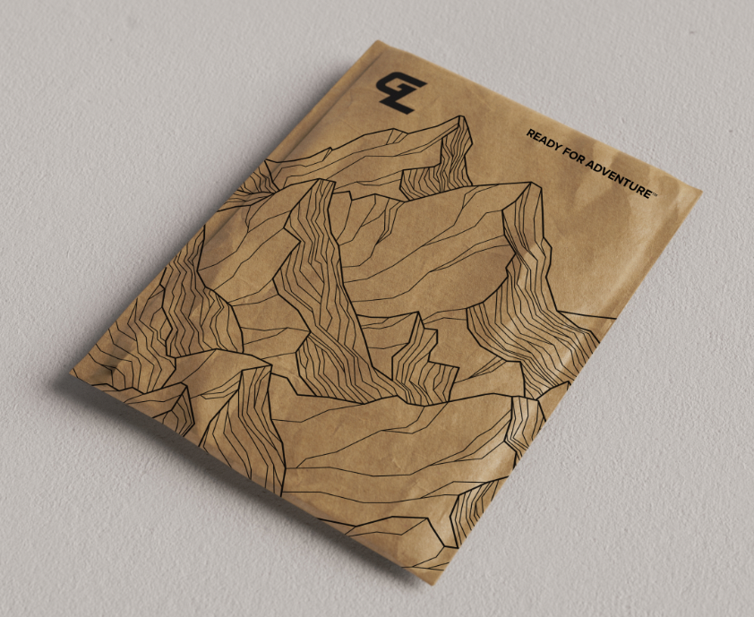
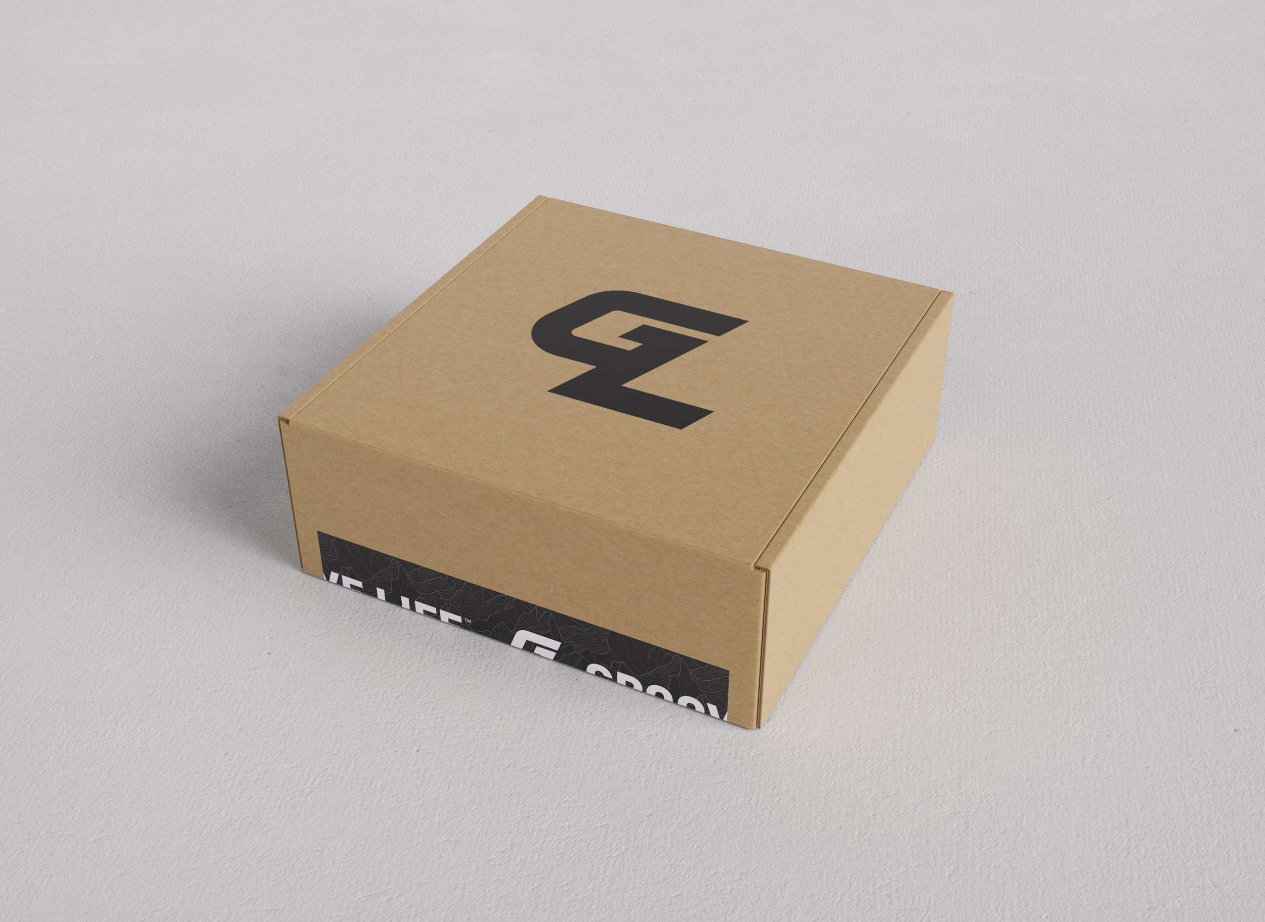
Our first step was breaking down the information, artwork, and brand guides of the current packaging and creating new additions while merging old assets. Along with their retail design we also designed concepts for their e-commerce packaging and shipping. I worked closely with my team’s product designer to create high-detail renderings of the new packaging and shipping assets.





Final Review
We produced well-detailed presentations for the Groove Life team, explaining our concepts and the process of actually producing these structures in a factory. The team provided us with any assets necessary and what they did not have we resourced on our own.
In the end, we were able to transfer all files we had to the Groove Life team for further production. Providing them with guided details on design materials and print processes needed for finalization.
